Semi-Realistic Fire Animation Only in CSS and HTML Tutorial
Even wondered how to create a fire and flames animation in CSS without Javascript? Just pure HTML and CSS! This article describes a simple way of creating non-trivial, complex-looking, not cartoon or pixel-art style fire animation. All used resources and codes are available for download so you can reproduce the effect as well on your own website. I first created a preview in Blender and tried to simulate it similarly to the the process used in Blender:
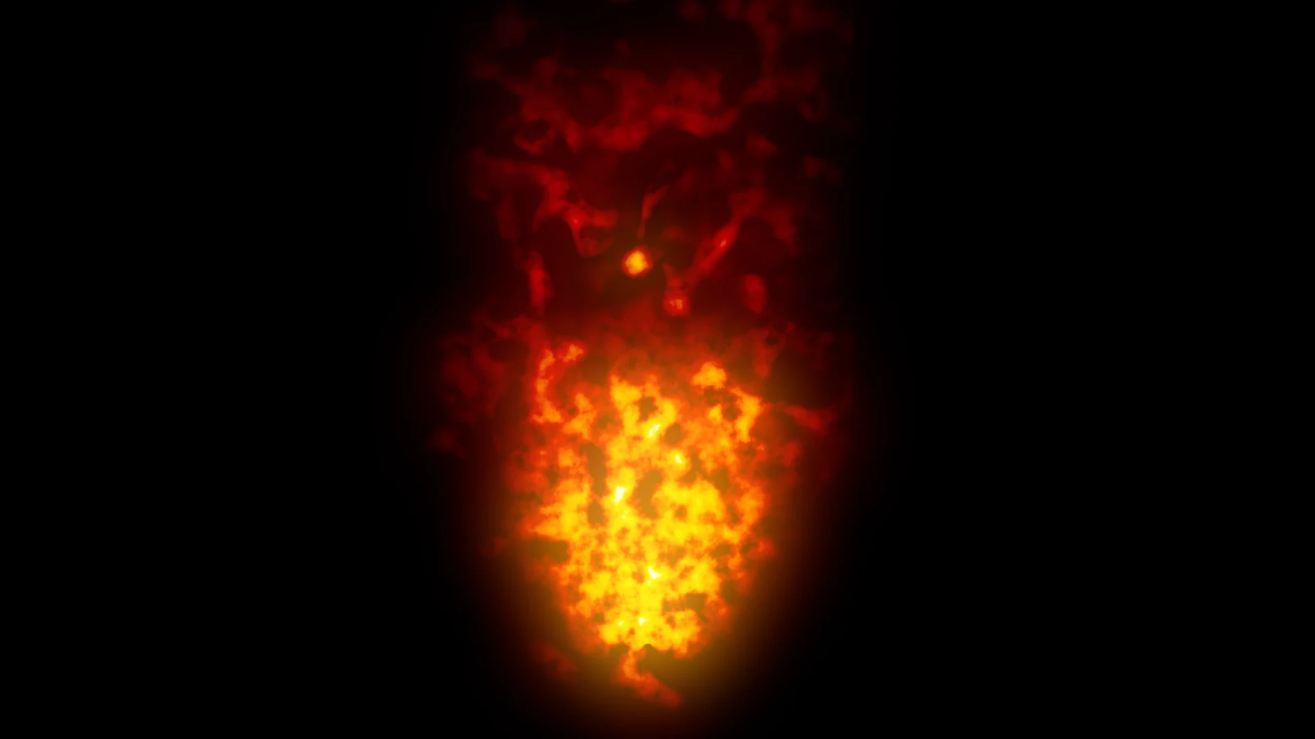
It is challenging to actually do the same operations in CSS so some features are limited but I think the result is quite nice. The result is here and can be adjusted to different size of the flames or shape of the burning area:
Use the slider to scale the flames.
The core of this animation is prerendered noise texture resembling the flames. I used a simple project in Blender to create the necessary images. To create a seamless loop, so when the same image is stacked repeatedly under each other their borders are not visible, the texture is split in halves. The bottom half is flipped vertically and both halves are smoothly blended in the middle where they meet (so they are a bit larger than half of the image's height). I combined normal and distorted clouds, which is basically Perlin noise. I created the following textures:
- Flames that are used to simulate the big flames coming up.
- Core which is used to simulate the dense burning area around the center of the fire.
- Flame mask a mask that clips the flames.
- Core mask a mask that clips the core.
Code
The rest of the process is described with the code:
#fire
{
  max-width: 50%;
  height: 800px;
  position: relative;
}
The fire element is a container for the whole thing.
.animatedParts
{
  background-repeat: repeat-y;
  -webkit-mask-size: contain;
  mask-size: contain;
  animation: burn 7s linear infinite;
  -webkit-mask-repeat: no-repeat;
  mask-repeat: no-repeat;
  -webkit-mask-position: center;
  mask-position: center;
  width: 100%;
  height: 100%;
  position: absolute;
  top: 0;
  left: 0;
}
The animatedParts element defines the animation itself. This class is used for two elements that define the flames and the core. The background image is repeated forever on axis Y. A mask is used to define the shape of the fire. The mask can, for example, be a blurred tree shape to simulate a burning tree. I use a simple cone blurred more to the top like a bonfire. Animation is defined to make the fire moving. The position is absolute and the elements fill the whole parent container. The flames and core are mixed over each other.
#flames {
  background: url("/img/articles/flames.webp");
  -webkit-mask-image: url("/img/articles/maskFlame.webp");
   mask-image: url("/img/articles/maskFlame.webp");
filter: sepia(100%) saturate(10000%) hue-rotate(299deg) drop-shadow(20px 20px 50px rgba(255, 0, 0,0.8));
}
The flames element contains the texture with large vorticies, simulating the big flames that leave the fire. The filter is used to colorize the grayscale texture, as it does not contain any color. The texture can be colorized in an image editor of course (maybe would even look a bit better) but I wanted to create a general one that can be set to any color easily. The shadow filter is used to create an additional glow around the flames.
#core {
  background: url("/img/articles/core.webp");
  -webkit-mask-image: url("/img/articles/maskCore.webp");
   mask-image: url("/img/articles/maskFlame.webp");
filter: sepia(100%) saturate(10000%) hue-rotate(314deg) drop-shadow(20px 20px 80px rgba(255, 255, 220 ,0.8));
}
The core element is very similar to the flames. It is the dense area at the bottom which is of lighter color.
@keyframes burn {
  from {
    background-position: 0 0;
  }
  to {
    background-position: 0 -5400px;
  }
}
The burn element defines the animation. The background texture is moving upwards by the whole height of the texture. It has to be moved to this amount to ensure that the texture then loops seamlessly, so there are no visible skips. Note that to achieve smaller flames you can add background-size property to flames or core. If you do so, you need to also edit the background-position value in the animation to match the size of the background for seamless loop.
</style>
<div id="fire">
<div id="flames" class="animatedParts"></div>
<div id="core" class="animatedParts"></div>
</div>
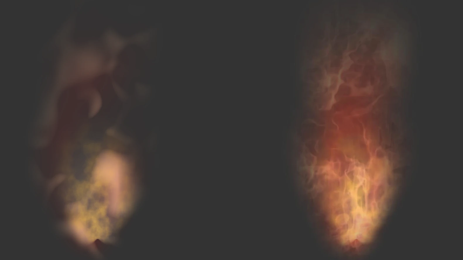
And this is a simple html setting containing all the described elements. To optimize the animation, it would be better to scale down the textures. I purposely made them huge so they can be played with. The way to improve the result is by creating different more detailed flame texture. For example, I tried to render a better texture for the flames in Blender using the fire and smoke simulation. You can try to switch the textures and see the result for yourself. It's also necessary to adjust the colors in CSS. I used these settings:
filter: sepia(100%) saturate(200%) hue-rotate(340deg) drop-shadow(20px 20px 50px rgba(255, 0, 0,0.8));
Here is the difference:
Keywords: CSS trick, HTML5, CSS3, burning, effect, animated
#css #csseffect #csstricks #htmlcss
Privacy Terms